Portfolio

ADZA

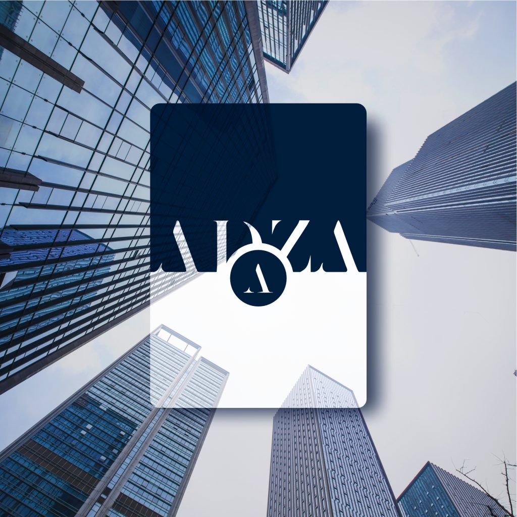
ADZA Bureau De Change Brand Identity Design This brand identity was developed for ADZA Bureau De Change Limited, a concept-stage financial exchange company with a vision rooted in excellence and sophistication. The design process involved extensive sketching and exploration to capture the high standards expected of the brand. The final identity features a refined palette of corporate blues—symbolizing trust, stability, and adaptability in a fast-evolving financial landscape. Client: ADZA Bureau De ChangeIndustry: Financial exchange sectorRole: Brand DesignerTools Used: Adobe, Coreldraw, Illustrator, Photoshop Logo Design Stationaries Flyers Digital Collaterals The Request ADZA Bureau De Change Limited, as a new entrant, wanted a distinct visual identity to communicate its values and establish credibility. Without a live platform or existing brand presence, the challenge was to craft a classic identity that could stand confidently among established players, while signaling professionalism, reliability, and forward-thinking service. The Solution We developed a classic yet contemporary brand identity that reflects ADZA’s commitment to excellence. The use of corporate blue tones conveys stability and trust, while the refined typography and layout evoke sophistication. The final identity is versatile, future-ready, and aligned with the brand’s vision to serve a diverse clientele—from individuals to large enterprises—with clarity and class. View All Works Next Work Let’s chat hello@orebzcretive.com Or connect with us on socials Behance Intagram LinkedIn

ADZA Read More »

Sirius Construction

Sirius Construction Brand Identity & Web UI Design Sirius Construction is a forward-thinking construction company that specializes in delivering strong, long-lasting structures for residential and commercial projects. The company aims to be a trusted partner in building spaces that are both functional and enduring. Their goal is to deliver durable structures while remaining reliable partners throughout each project’s lifecycle — from concept to completion. Client: Sirius ConstructionIndustry: Construction & EngineeringRole: Brand DesignerTools Used: Adobe, Figma, Illustrator, Photoshop Logo Design Stationaries Website UI Design Digital Collaterals The Request Despite offering solid craftsmanship and dependable service, Sirius Construction lacked a visual identity that truly represented its professionalism and ambition. Without a clear and compelling brand image, they risked being overlooked by prospective clients and partners. The Solution We designed a logo that fuses structural geometry with the letter “S,” symbolizing strength and stability. The color palette and typography reinforce a confident, clean, and professional tone — ideal for print, site signage, and digital materials. From the very first presentation, the branding blew us away. It was exactly what we wanted but couldn’t articulate ourselves — bold, clean, and meaningful. They understood our vision and translated it into a brand and website that truly reflect who we are. Tunde A. Co-Founder, Sirius Construction View All Works Next Work Send me a message hello@orebzcretive.com Or connect with us on socials Behance Intagram LinkedIn

Sirius Construction Read More »

Flashreed

Flashreed Brand Identity & Collateral Design About The Brand Flashreed is a digital-first news agency aiming to revolutionize how stories are told online. The brand needed a striking identity that communicates speed, credibility, and relevance — all while standing out in the highly saturated digital media space. Client: FlashreedIndustry: Digital Media / NewsRole: Lead Brand DesignerTools Used: Adobe Illustrator, Photoshop Logo Design Stationaries Newsletter Digital Collaterals The Problem Flashreed, a new digital news agency, needed a distinct brand identity that could cut through the noise in a crowded online news space. The challenge was to visually communicate speed, credibility, and modernity — all while building trust with a digital-first audience. The Solution We designed a bold and clean visual identity that reflects Flashreed’s mission to deliver fast, reliable news. A carefully chosen color palette reinforces urgency and trust, while adaptable brand collateral — including stationery and digital templates — ensures consistency across all platforms. The final design system gives Flashreed a confident, recognizable look that supports its voice as a modern news brand. Working with Orebz on the Flashreed brand was a turning point for us. The design perfectly captured the fast-paced, digital-first nature of our news platform while still looking clean and credible. We’ve received compliments from both readers and partners, and we’re proud to show off our new look. Emeka Gerald Founder Send me a message hello@orebzcretive.com Or connect with us on socials Behance Intagram LinkedIn Let’s discuss your brand and business goals and objectives Please enable JavaScript in your browser to complete this form.Name *Email *Comment or Message * Submit

Flashreed Read More »