admin

RCCG Joseph’s Palace

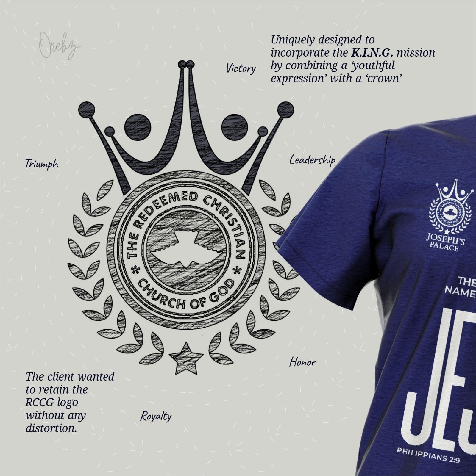
Jesus Palace YP1 Brand Identity  Originally known as @JosephsPalace and now rebranded as @JesusPalaceYP1, this youth ministry under RCCG sought a logo that would resonate deeply with young believers while honoring its spiritual heritage. The design needed to reflect the K.I.N.G. mission—a call to Kingdom Identity, Nurture, and Growth—while preserving the RCCG crest in its original form Client: RCCG Joseph’s PalaceIndustry: ChurchRole: Brand DesignerTools Used: Adobe, Figma, Illustrator, Photoshop Logo Design Digital Collaterals The Request The client asked for a logo that would speak directly to young people, embody the K.I.N.G. mission, and faithfully preserve the RCCG crest—exactly as it is. The goal was to create a symbol that felt fresh and inspiring, while remaining rooted in spiritual tradition and scriptural meaning The Solution I approached the design with reverence and creativity. The RCCG crest was kept untouched at the center, serving as the spiritual anchor. Around it, I built a visual narrative: – A crown to symbolize youthful royalty and divine identity and an Olive branches to represent victory, honor and peace—drawing from scriptural symbolism It works seamlessly across digital platforms, merchandise, and ministry materials. I am very proud to say you pulled this logo to reality for us. You stayed focused on our goal while maintaining a high level of professionalism despite the back and forth. It is truly a honor Ayo Omowunmi A. Project Member View All Works Next Work Send me a message hello@orebzcretive.com Or connect with us on socials Behance Intagram LinkedIn

RCCG Joseph’s Palace Read More »

Ekklesia music

Ekklesia Music Brand Identity About The Brand Ekklesia-Music is a musical worship brand designed to inspire deep connection through music, fellowship, and spiritual devotion. The concept blends visual storytelling with sacred symbolism, creating a brand identity that resonates with worship communities and creatives alike. The Request Ekklesia-Music needed a brand identity that could bridge traditional worship with modern digital platforms. The challenge was to create a visual and conceptual language that felt sacred yet contemporary—one that could resonate with worship communities while thriving in the streaming space. The Solution Designed with music and streaming in mind, we developed a brand concept that harmonizes spiritual symbolism with sleek, digital-ready design. The identity evokes warmth, rhythm, and reverence, using typography, icon and color to reflect both tradition and innovation. View All Works Next Work Send me a message hello@orebzcretive.com Or connect with us on socials Behance Intagram LinkedIn

Ekklesia music Read More »

ADZA

ADZA Bureau De Change Brand Identity Design This brand identity was developed for ADZA Bureau De Change Limited, a concept-stage financial exchange company with a vision rooted in excellence and sophistication. The design process involved extensive sketching and exploration to capture the high standards expected of the brand. The final identity features a refined palette of corporate blues—symbolizing trust, stability, and adaptability in a fast-evolving financial landscape. Client: ADZA Bureau De ChangeIndustry: Financial exchange sectorRole: Brand DesignerTools Used: Adobe, Coreldraw, Illustrator, Photoshop Logo Design Stationaries Flyers Digital Collaterals The Request ADZA Bureau De Change Limited, as a new entrant, wanted a distinct visual identity to communicate its values and establish credibility. Without a live platform or existing brand presence, the challenge was to craft a classic identity that could stand confidently among established players, while signaling professionalism, reliability, and forward-thinking service. The Solution We developed a classic yet contemporary brand identity that reflects ADZA’s commitment to excellence. The use of corporate blue tones conveys stability and trust, while the refined typography and layout evoke sophistication. The final identity is versatile, future-ready, and aligned with the brand’s vision to serve a diverse clientele—from individuals to large enterprises—with clarity and class. View All Works Next Work Let’s chat hello@orebzcretive.com Or connect with us on socials Behance Intagram LinkedIn

ADZA Read More »

Roots Africa

Roots Africa Report Design About The Brand Roots Africa Inc. is an international NGO working to end hunger and poverty across Africa through education and empowerment. By teaching resilient agricultural practices, they equip communities to grow sustainably. Their programs also foster entrepreneurship, helping individuals build livelihoods and drive long-term change. The Request Despite their transformative work, Roots Africa faced a challenge: their reports lacked visual clarity and emotional resonance. The data was compelling, but the presentation didn’t reflect the urgency or innovation of their mission. They needed a design that could bridge the gap between raw metrics and human impact—something that would inspire action and amplify their message. The Solution Orebz crafted a report design that balances professionalism with storytelling. Using clean layouts, bold typography, and a color palette inspired by agriculture and growth, the design highlights key metrics while centering the voices of changemakers. Infographics and visual cues guide readers through complex data, making the report both digestible and emotionally engaging. The final product empowers Roots Africa to showcase their work with clarity, confidence, and heart The report design brought our mission to life in a way we hadn’t seen before. Orebz’s work helped us communicate our impact with clarity, emotion, and professionalism—making it easier to connect with donors, partners, and communities. The visuals were thoughtful, the layout intuitive, and the storytelling powerful. It’s more than a report—it’s a reflection of who we are. Cedric N. Founder View All Works Next Work Send me a message hello@orebzcretive.com Or connect with us on socials Behance Intagram LinkedIn

Roots Africa Read More »

Sirius Construction

Sirius Construction Brand Identity & Web UI Design Sirius Construction is a forward-thinking construction company that specializes in delivering strong, long-lasting structures for residential and commercial projects. The company aims to be a trusted partner in building spaces that are both functional and enduring. Their goal is to deliver durable structures while remaining reliable partners throughout each project’s lifecycle — from concept to completion. Client: Sirius ConstructionIndustry: Construction & EngineeringRole: Brand DesignerTools Used: Adobe, Figma, Illustrator, Photoshop Logo Design Stationaries Website UI Design Digital Collaterals The Request Despite offering solid craftsmanship and dependable service, Sirius Construction lacked a visual identity that truly represented its professionalism and ambition. Without a clear and compelling brand image, they risked being overlooked by prospective clients and partners. The Solution We designed a logo that fuses structural geometry with the letter “S,” symbolizing strength and stability. The color palette and typography reinforce a confident, clean, and professional tone — ideal for print, site signage, and digital materials. From the very first presentation, the branding blew us away. It was exactly what we wanted but couldn’t articulate ourselves — bold, clean, and meaningful. They understood our vision and translated it into a brand and website that truly reflect who we are. Tunde A. Co-Founder, Sirius Construction View All Works Next Work Send me a message hello@orebzcretive.com Or connect with us on socials Behance Intagram LinkedIn

Sirius Construction Read More »

Flashreed

Flashreed Brand Identity & Collateral Design About The Brand Flashreed is a digital-first news agency aiming to revolutionize how stories are told online. The brand needed a striking identity that communicates speed, credibility, and relevance — all while standing out in the highly saturated digital media space. Client: FlashreedIndustry: Digital Media / NewsRole: Lead Brand DesignerTools Used: Adobe Illustrator, Photoshop Logo Design Stationaries Newsletter Digital Collaterals The Problem Flashreed, a new digital news agency, needed a distinct brand identity that could cut through the noise in a crowded online news space. The challenge was to visually communicate speed, credibility, and modernity — all while building trust with a digital-first audience. The Solution We designed a bold and clean visual identity that reflects Flashreed’s mission to deliver fast, reliable news. A carefully chosen color palette reinforces urgency and trust, while adaptable brand collateral — including stationery and digital templates — ensures consistency across all platforms. The final design system gives Flashreed a confident, recognizable look that supports its voice as a modern news brand. Working with Orebz on the Flashreed brand was a turning point for us. The design perfectly captured the fast-paced, digital-first nature of our news platform while still looking clean and credible. We’ve received compliments from both readers and partners, and we’re proud to show off our new look. Emeka Gerald Founder Send me a message hello@orebzcretive.com Or connect with us on socials Behance Intagram LinkedIn Let’s discuss your brand and business goals and objectives Please enable JavaScript in your browser to complete this form.Name *Email *Comment or Message * Submit

Flashreed Read More »

TBNC

TBNC Brand Identity & Web UI Design TBNC Music is an independent record label and artiste management company based in Nigeria, focused on promoting innovative and unique talent. The brand needed a visual identity that could reflect its creative energy while remaining professional and industry-ready. The Request TBNC Music wanted a distinct brand identity that could communicate its dual mission: to manage artists with integrity and promote music that resonates. The challenge was to design a symbol that felt bold, protective, and deeply connected to sound and creativity. The Solution The final design combines a shield—symbolizing protection, strength, and guidance—with a soundwave motif that represents rhythm, voice, and artistic expression. This fusion creates a logo that is both iconic and meaningful, capturing TBNC Music’s role as both guardian and amplifier of talent. View All Works Next Work Send me a message hello@orebzcretive.com Or connect with us on socials Behance Intagram LinkedIn

TBNC Read More »